- Free Consultation: (631) 352-0050 Tap Here to Call Us


Employment Law Firm Launches Revamped Website
On November 1, 2023, the employment law firm Famighetti & Weinick PLLC, launched a revamped website in preparation for its 10th anniversary year. F&W anticipates that the brighter, fresher look to the website will enhance users’ experiences, while continuing to provide quality content about both the firm’s services, and employment law topics.
In 2014, F&W opened its doors. As part of its branding, F&W embraced brown colors to invoke a sense of traditional law firms’ offices which typically use woods to adorn entrances, hallways, and conference rooms. From the earliest iterations of the firm’s website to the most recent, brown played a prominent role in the firm’s web designs.
As the firm approaches its 10th anniversary year, the time has come to move away from tradition and towards embracing F&W’s own unique identity. The website’s new appearance embraces important elements from past web designs, but also introduces new colors and symbols to define the firm’s identity.
We have previously blogged about the firm’s orange logo tile and its symbolism. We noted that orange represents many of the values embraced by the firm such as creativity, determination, and enthusiasm. We also wrote about orange’s psychological effects, including its ability to invoke a positive outlook on life, its ability to keep people motivated, and its tendency to offer strength in difficult times. Accordingly, orange is not going anywhere. The F&W orange tile remains prominently featured at the top of the website, displayed across all pages on the site. Moreover, orange is sprinkled across other elements of the redesigned site to mirror the logo.
FW Orange Logo
The full F&W logo has not gone completely untouched though. The Famighetti & Weinick lettering, previously white, has been colored with “FW Blue.” The blue mirrors the most prominent changes to the website — the move away from the darker browns and towards brighter whites, greys, and — FW Blue. Brown title bars are now FW Blue, background images are shaded in lighter grays and blue, and the overall background color of the website has shifted to white.
These changes have the practical purpose of making the website’s overall look and feel to be cleaner and fresher, with easier readability. But, the changes are not without symbolic purpose. The orange and blue used in the logo and throughout the site are a reference to F&W’s beginnings. Stay tuned for a featured 10th anniversary blog detailing the firm’s genesis story, but as a sneak preview, the firm’s founders, Peter Famighetti and Matt Weinick, first met while working as Deputy County Attorneys for the County of Nassau. Nassau’s colors are orange and blue, thus the firm’s new color palette – blue and orange – is an homage to that history.
Introducing FW Blue
The use of white as the primary background color represents the firm’s straightforward and practical approach to the practice of law. The firm strives to provide its clients with realistic legal advice tailored to meet the needs of each individual case, and with a strategy developed to meet each individual client’s goals. White signals this “blank canvas” approach to helping clients, instead of a cookie cutter approach to clients’ cases.
Finally, on color, brown is not completely abandoned. As with other colors that represent the past and the firm’s history, brown lettering returns to the redesign in subtle, yet important ways. For instance, brown is used for some internal site links, and for the invitation to accept an offer for free consultations.
The redesign invokes other imagery, as well. The heading banner displayed across all pages of the website features Pete and Matt standing in front of a rotating background of images. The first image is Lady Justice. Though perhaps a bit cliche for a law firm, there nonetheless remains no greater symbol of a system of justice than Lady Justice. The picture is intended to remind us all of the values and principles upon which our legal system is founded.
The second image is the downtown Manhattan skyline, back-dropped against the Brooklyn Bridge, which is the central component of the intended messaging. The Brooklyn Bridge almost directly connects the two primary courts in which F&W works. On the Manhattan side of the Brooklyn Bridge sits the courthouse for the United States District Court of the Southern District of New York. Located on Pearl Street, just blocks from the bridge, the S.D.N.Y. is the federal court which serves Manhattan, the Bronx, and many Hudson Valley counties.
On the Brooklyn side, the bridge is anchored near Cadman Plaza, home to the courthouse for the United States District Court of the Eastern District of New York. The E.D.N.Y. serves Staten Island, Brooklyn, Queens, and Long Island. Because the civil rights and employment cases handled by F&W almost always involve federal laws, the overwhelming majority of F&W’s cases are litigated in either the S.D.N.Y. or the E.D.N.Y. The view of the bridge, from east towards the west, also signifies the firm’s Long Island home base.
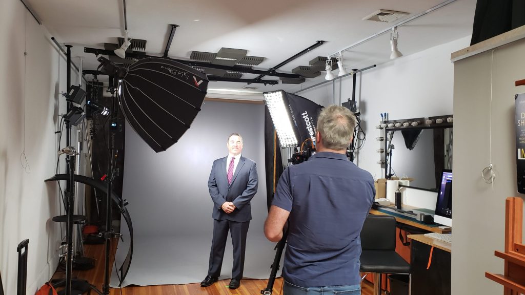
The final enhancement is fresh photography. This past summer, Pete and Matt spent an afternoon with a professional head-shot photographer. The photographer employs a psychological approach to his work designed to capture, not just the individual’s image, but the individual’s essence.
Pete works with photographer to draw out his essence
After the shoot, the partners reviewed perhaps hundreds of photos to find the right ones. The final products have been integrated into the new web design, including in a new “meet our team” section directly on the homepage.

Do you see our essence?
Though the appearance has changed, the content that F&W has developed over the past decade remains consistent. Website users can expect access to the perhaps hundreds of blogs that the firm has published about legal and firm related current events, developments in the areas of employment and civil rights law, and other news of interest. Spanish content remains accessible as does the catalog of instances in which the firm and/or its cases have received press attention.
F&W hopes that users enjoy the new website experience. This is just the first step to kicking off F&W’s 10th anniversary year. Be sure to subscribe to our social media channels (links at the bottom of the page) to be the first to learn about 10th anniversary celebration news and events.

Employment lawyers launch website redesign